Written by Carrie Cousins
Source from DesignModo.com
We all dream in color. Every design concept and sketch comes with some sort of color association. But what do those colors mean? What associations are we making just with that choice alone?
Orange could be called the most controversial color. People either love it or hate it.
Orange can have either positive or negative associations. The hue, whether it is saturated more with red or yellow, can feel earthly or aggressive or more happy and warm. Commonly, orange is linked to heat and energy because it is the color of fire and a citrus fruit.
In the most pure forms, orange stirs up a bit of color controversy. The color associations people have with orange are usually quite strong, in part because of the nature of the color. Orange is a high-visibility color and is often used to catch people’s attention in print and web publication; therefore it can make a great accent color.
Orange represents fire and the sun and is thought to help stimulate the brain and appetite. The color is also representative of nature and the autumn, because it is part of the range of colors on display when trees begin to lose their leaves.
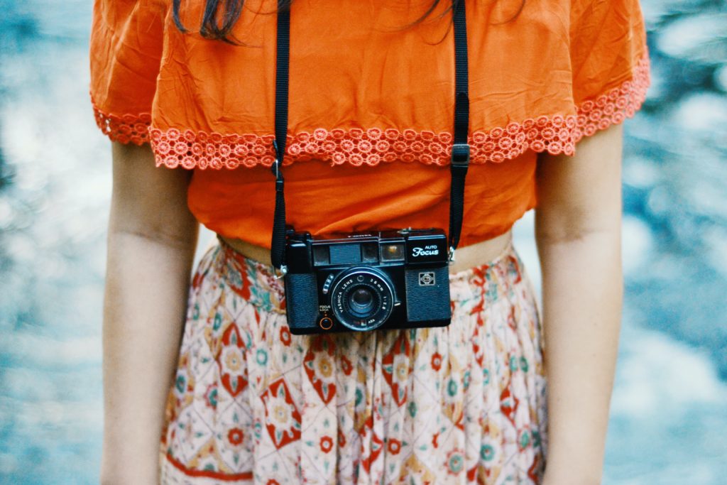
On the other hand, paler hues can be calming and have wide-ranging appeal to both men and women. Brighter oranges are more accepted by younger people rather than older generations.
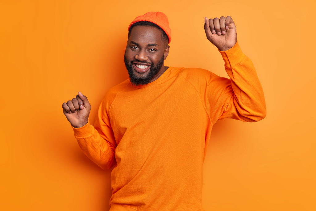
Positive meanings of orange include warmth, energy, youthfulness, health and adventure. The most common negative associations of the color include crassness, rudeness and frivolity.